One Room Challenge Week 3: Sensory-Sensitive Lighting & Paint Update

A reminder of where we started

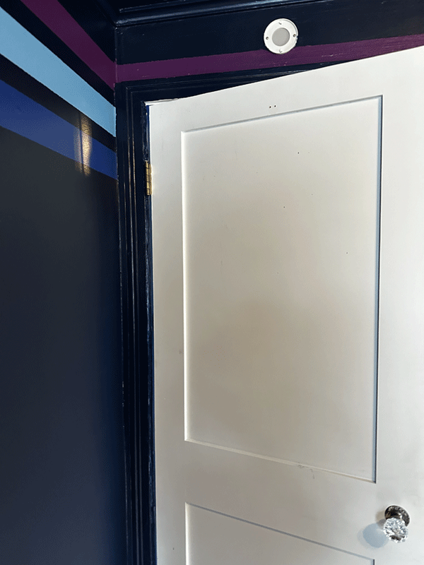
This is where we left off last week

Hello! Yay, I’m so excited that you made it to my One Room Challenge Spring 2024 Week 3 Progress update.
If you're just joining the party, I’m Julie Ann of Julie Ann Rachelle Interiors, transforming my nephew’s bedroom and customizing it for SPS (Sensory Processing Sensitivity.) His name is Logan, he lives about an hour and a half away with his parents, his mother being my sister. Logan will turn 13 at the end of this One Room Challenge process! You can check out the previous weeks here: Week 1 | Week 2 .
Trust me, start with Week 1 – that's where I spill all the tea on my goals for this challenge, tons of before pics, and the inspirational photos.
Then, head over to Week 2 to view my design concept, and the reveal of the painted stripes video.
Speaking of checking things out, before we dive into this week's updates, you gotta see all the amazing participants in this challenge! It's seriously been a blast working alongside so many creative and talented blogger buddies. I’m so excited to check out all of their One Room Challenge project progress updates!

Sponsored by:


Check out this old photograph of myself, Logan (kindergarten), and my sister!

Logan and his puppy at the beginning of 7th grade. They grow so fast, Logan is taller than my sister now!

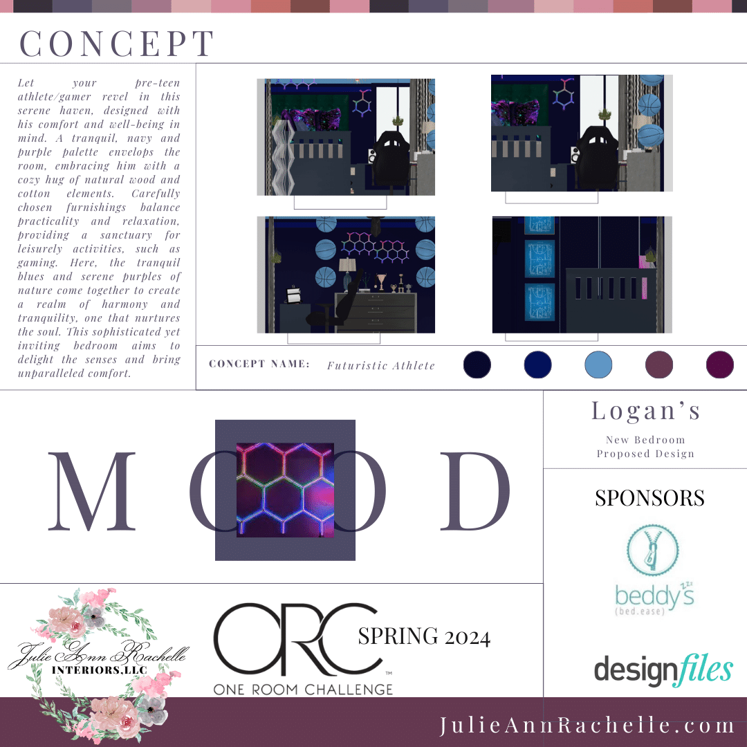
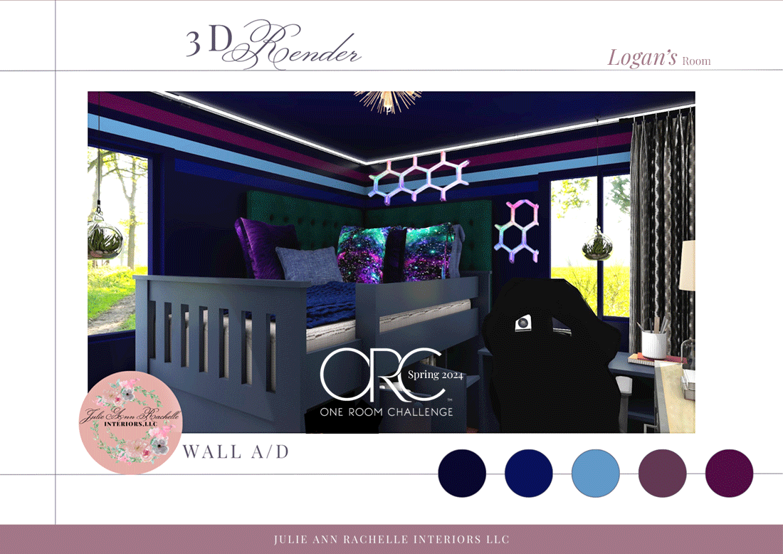
This is our goal for the room, though some particulars have since changed, and you can see more 3D renders here.
Today I want to cover the lighting in his room which is extra special, as promised, and share the painting process photographs that my sister sent me. The painting is almost all done, the doors still needing final painting touches! Plus, fellow ORC participants have chimed in with their best painting tips! (If I was unable to get a message to you due to Instagram’s spam filters, and you want to send me a painting tip to be included with your link, use my contact button above.)
Okay, enough chit-chat, let's get down to business! This week's update...well, you'll just have to wait and see! But seriously, I can't wait to share it with you. Jump in the comments and tell me what your favorite part of the makeover has been so far!

Table of Contents:
Week 2 Feedback Summary and Questions Answered
Week 3’s Progress: Painting Progress
Painting Tips: ORC Participants Advice on Painting
Week 3 Feature Product: Govee Glide Y Lighting Accents
Week 3 Sponsor Highlight: Beddy’s (Note! Beddy’s anniversary sale is going on right now. Buy One, Get One 50% off site-wide. Whoa, now that's a great deal on Beddy's! Save up to 50% on Beddy's, the easiest bed to make, or on our new ZipBase Beddy's, which makes it even EASIER (especially on laundry day). Once you try zipper bedding, you'll want it for the entire house!”
Use code: 10BDAYBOGO
Progress Recap of Previous Weeks
Week 1
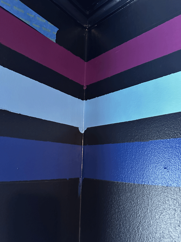
I introduced Logan in Week 1, and focused mainly on how the design is going to help his sensory sensitivities. I shared the color palette of blues, and purples, which was selected after Logan picked navy blue as his main paint color. (I am beginning to think that he wanted navy because he loves LED lighting, and as photographs of bedrooms with only LED lighting on often have a dark blue glow. He might have confused as the room’s paint color. This has just recently dawned on me after we designed his room 10 months ago, and started painting it maybe 4-6 weeks ago? My sister not only painted the ceiling, walls, and trim navy, I also gave her the task of painting three stripes near the ceiling, which as unveiled in Week 2!

Week 2
As I mention above, Week 2 begins with a reveal video of removing the painter’s tape to show the painted stripes. Since I am not a DIYer, used to working with hired hands, I didn’t know that it is a faux pas to leave the painter’s tape on for an extended period of time. The reason she didn’t remove it right away was not only inexperience, but also because she wanted to do a reveal with me and Logan present. Since I live so far away, it was a couple of days before we could arrange it. Last week I also shared the design presentation that I created when for Logan and my sister Dana. Last but not least, I featured one of our sponsors, DesignFiles, in last week’s post - explaining how I use their platform in my design process.

Week 2 Feedback and Questions
After receiving wonderful feedback and questions in Week 1, I decided that I will share it again this week. I am really enjoying this sense of community within the ORC.
General Enthusiasm:
Many commenters expressed excitement and admiration for the design process and the tween bedroom ideas. Common sentiments include enthusiasm for the detailed and creative designs, with specific praises for elements like pillow fabrics and unique pieces, the article’s detail, appreciation for the design concept including wall-mounted basketballs, a fun theme, and customization for sensory needs.

Questions and Interactive Comments:
Allison C: Questions about the nephew’s involvement in the design process.
Answer: We received my nephew's approval at every stage, with some elements left as a surprise. He wants a big reveal at the end, HGTV style!
Challenges and Tips Shared:
Farrah: Discusses the calming effect of blues and greens and the practicality of a loft bed.
Kebba Buckley Button: Offers painting tips and shares personal preferences for room design.
Angie: Plans to apply the insights to her own home project, converting a dining room into a reading nook.
Advice given in response: I provided detailed suggestions for creating a cozy reading nook.
Encouragement and Future Engagement:
Elizabeth, Debbie, Emily, and Beth: Look forward to future posts and express their continued interest in following the project.
Stephanie and Veronica Samos: Discuss the need to update their children’s rooms, with Veronica focusing on the balance between a tranquil retreat and a gamer’s paradise.
Concerns and Clarifications:
Lily Leung: Finds the article hard to follow.
Answer: Offers to clarify any confusions and explains the video content. I rewrote the article to be easier to understand.
Week 3 Progress
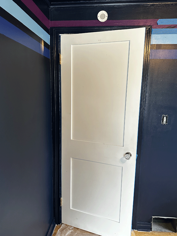
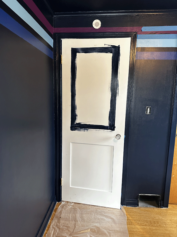
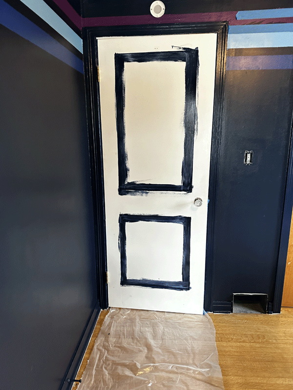
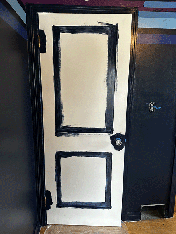
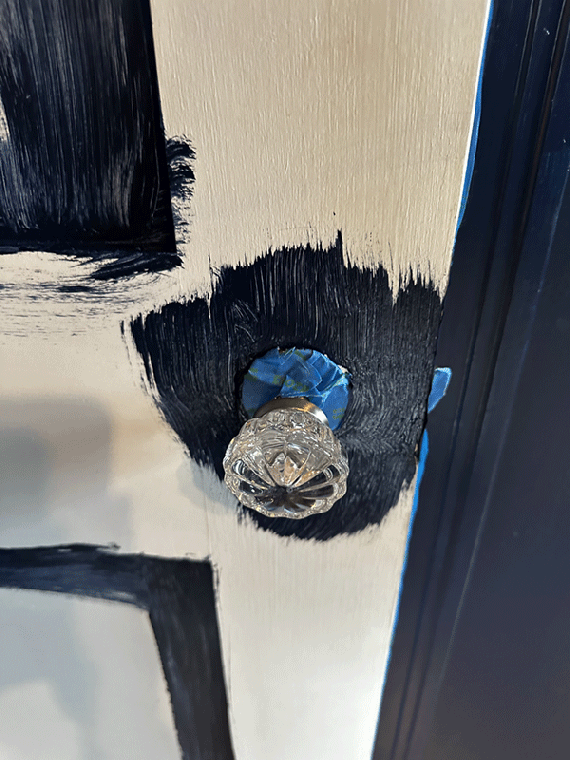
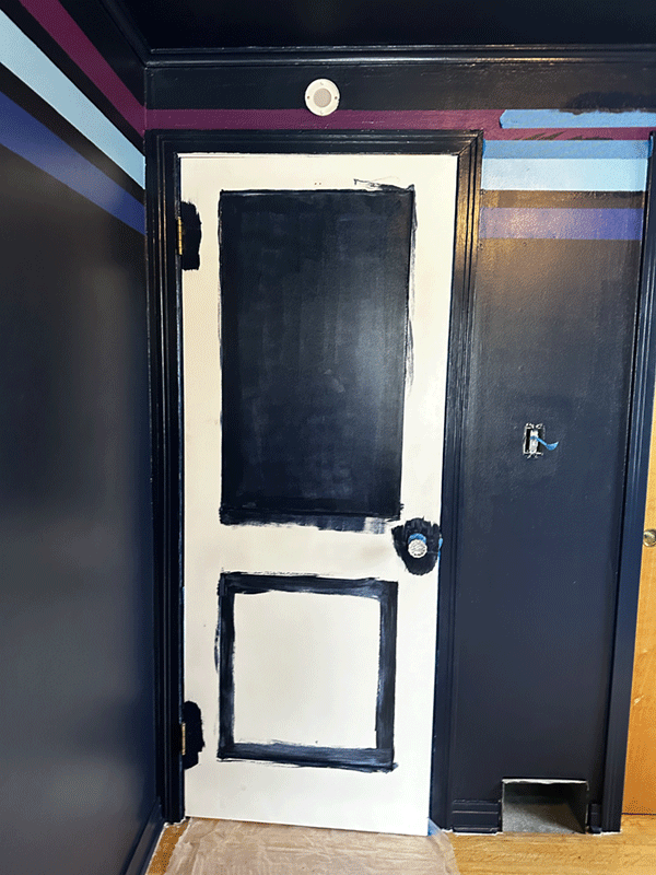
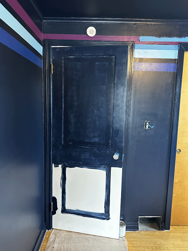
This week my sister started painting the doors. She might be finished by now, she sent me these photos a few days ago.
Custom printed fabric for the headboards was delivered, as well as new knobs for the dresser that stores under the loft bed. This weekend I hope to upholster the headboard with this special fabric. We also received a package of campaign hardware that we will add to the loft bed to customize it and have it match the campaign style chest of drawers.
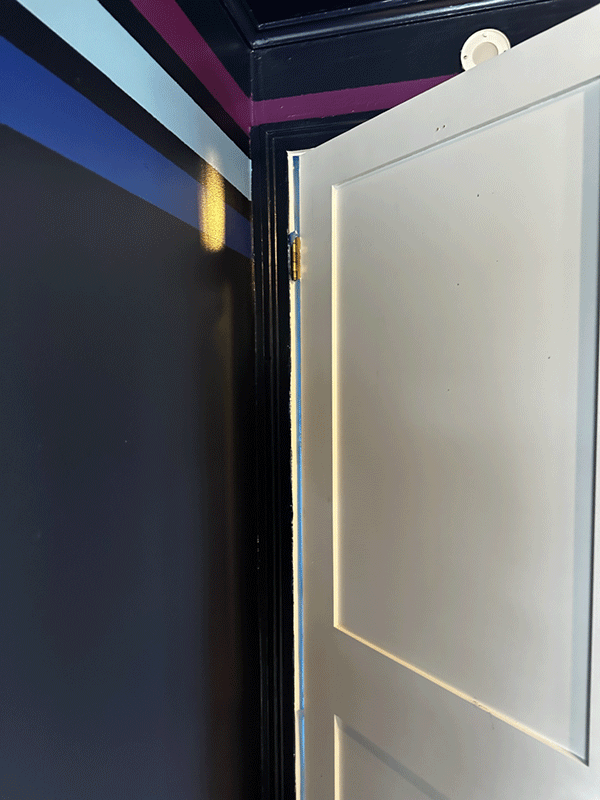
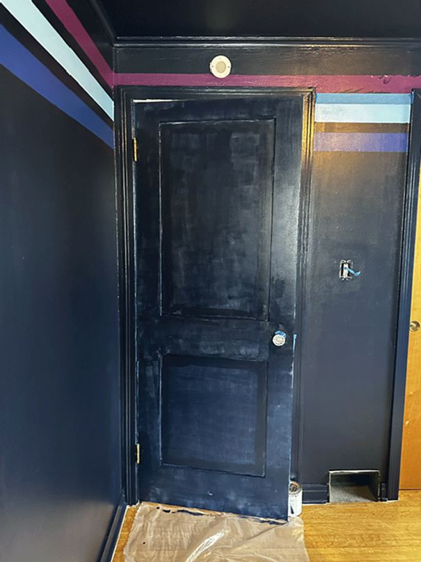
My sister also did some touch-up painting, working on fixing the stripes. More touching up to come over the weekend!
BEFORE
AFTER

28 Interior Painting Tips from Fellow ORC participants
Since I am not the DIYer, I attempted to contact fellow ORC Spring 2024 participants to ask them their favorite painting tip, however, I soon ran up against the Instagram spam bot. If you would like to contribute a tip and were not yet contacted, please send your best tip via my contact page. These tips are so interesting and away from the norm, that I had to share!
Here are tips that Spring 2024 fellow participants offered:

“Best painting tip is definitely to upcycle whenever you can. Especially for those on a budget, get a quart of Behr furniture paint in semi gloss and take that old chair hanging out in the attic to give it new life with a fresh coat. Or find some accessories that are good shapes and lines but maybe drab in color. No problem just get a can of rustoleum spray paint (in a zillion color choices) and you’ve elevated your decor to something bold and colorful. You can even tape half of the item to reveal a color block look or try two different colors of spray paint (wait for each to dry completely before spraying the next layer/color).” - Amanda Foster, Foster Decor Consulting

“My #1 tip is to use high-quality tape to mark your painting area and ensure a crisp edge. After applying the tape, run a card or similar tool over it to ensure it adheres well to the surface and prevents any paint bleed.” - Sidrah @craftycapture

“Here’s a paint tip based on this instagram post. Love a paint accent but don’t want to commit to a whole wall? Think outside the box! For this gallery, we chose a circular accent in Clare Paint’s Hyperlink blue to break up all the white in the room and to add some curves to this very rectangular display. Paint doesn’t always need to cover the whole wall, how can you add a little unexpected color to YOUR home today?” - The Honey House

“My go-to tip for painting is to tape your roller. Take your painters tape and cover the paint roller with it all the way across, then peel the tape back and any loose lint is on the tape rather than left of your walls!” - Heather Robillard
I also did some research on painting tips that past One Room Challenge participants offered on their blogs:

“One tip I’ve learned when not painting yourself, do not be afraid to speak up about the job done. We did have to follow up with our contractor two separate times to finish the paint job as we liked it. It was worth them coming back to have the job done right.” - Brendt Blanks
Source: One Room Challenge: Week 5 (Painting Completed And Cleaning Plan) | She Gave It A Go, https://shegaveitago.com/one-room-challenge-week-5-painting-completed-and-cleaning-plan/, Brendt Blanks

SELECTING PAINT
If you are looking for a paint/wallpaper company that offers eco-friendly and sustainable options, the Rural Legend recommends using LICK.com: Designer Wall Paint, Modern and Contemporary Wallpaper.
Source: Moody blue paint for a basement family room, https://www.therurallegend.com/post/one-room-challenge-week-6-we-have-paint

“I always encourage clients to consider a paint change, even if it wasn’t on their radar initially. I’ve never been disappointed in my decision to bust out my paint brush.” - Leslie Westendorf, MaxPatch Studio
Source: Maxpatch Studio ORC Week 2: Paint — Maxpatch Studio, https://www.maxpatchstudio.com/journal/2019/one-room-challenge-week-2, Leslie Westendorf, 2019-04-08

“When painting walls, I always use a paint that includes a primer. I typically like to stick to the $30/gallon range when I'm choosing my paint. I love Home Depot's Behr Premium Paint + Primer and Lowe's HGTV Home by Sherwin Williams Showcase.” - Rebecca
Sourcee: One Room Challenge Week 2: Painting Tips | R&R at home, https://www.randrathome.com/2019/04/one-room-challenge-week-2-painting-tips.html, Rebecca

“How to Select Paint Colors. according to Ama Designs & Interiors
TIMING: Select paint colors in the room they will be going in during the day. (My rule is to select during the day. Not at night and and not in direct sunlight.)
VIEWPOINT: : Select paint colors looking at the color at a vertical angle because the paint will be on a vertical surface. Lighting obscures color so it’s important to view the color as the light would hit.
LIGHTING: Has your lighting been installed? Pick colors with the finalized lighting. This part slowed down my process because I was waiting for all the high-hats to be installed. Before, I had zero overhead light fixtures which would make a HUGE impact in the final result.
TEST SAMPLE: Test the sample first! Paint a swatch on white poster board and post it on the wall to view the color objectively. The white background allows you to view the color for what it is. Looking at the paint color on another colored wall will obscure the colors. Decide on the sheen level of your paint too. Matte finish will look different than a high-gloss finish due to the sheen and reflective light quality
CHECK BACK: View and admire your Test swatch at all times of day. Take note which shades you gravitate to more. Do you still think Choice #1 is your favorite?
FINALIZE: Pick out your final paint colorThis is my no-fail paint selecting process. It has worked every single time. I have NEVER had to repaint a room, unless I got bored and wanted to spruce things up.”
Source: One Room Challenge Week 4: Painting — AMA DESIGNS & INTERIORS, https://www.byamadesigns.com/blog/one-room-challenge-week-4-painting

“When I tested a patch over primer it showed much more yellow and had me worried that it would be too yellow. Exactly why you always want to patch test over primer and give it a few days to see all the lighting throughout the day.”
Source: ONE ROOM CHALLENGE LOUNGE | Week 2 – The Power of Paint -, https://jenniferjsullins.com/2020/10/15/one-room-challenge-lounge-week-2-the-power-of-paint/, Jennifer J Sullins, 2020-10-15

Selecting paint color based on the room’s orientation, according to Jeweled Interiors:
“It all comes down to the sun, it’s path, and characteristics. We all know that the sun rises in the East and sets in the West. This means that first thing in the morning it hits northward facing rooms and then curves up and over eastward facing rooms in the mid morning. After this it spends the rest of the day in southward and westward facing spaces.
Also, it is helpful to keep in mind that morning light is less intense and cooler (less yellow) while afternoon light is more intense and warmer (more yellow).
In general (though not always), picking a paint color that is the opposite of the sunlight that is hitting the room at its most intense time will balance out the tones. If the natural light in a room reads overly warm, then picking a toned down/gray downed color would be lovely.”
Source: 5 Farrow and Ball Paint Tips ⋆ Jeweled Interiors, https://jeweledinteriors.com/2020/04/5-farrow-and-ball-paint-tips/, jeweledinteriors, 2020-04-21
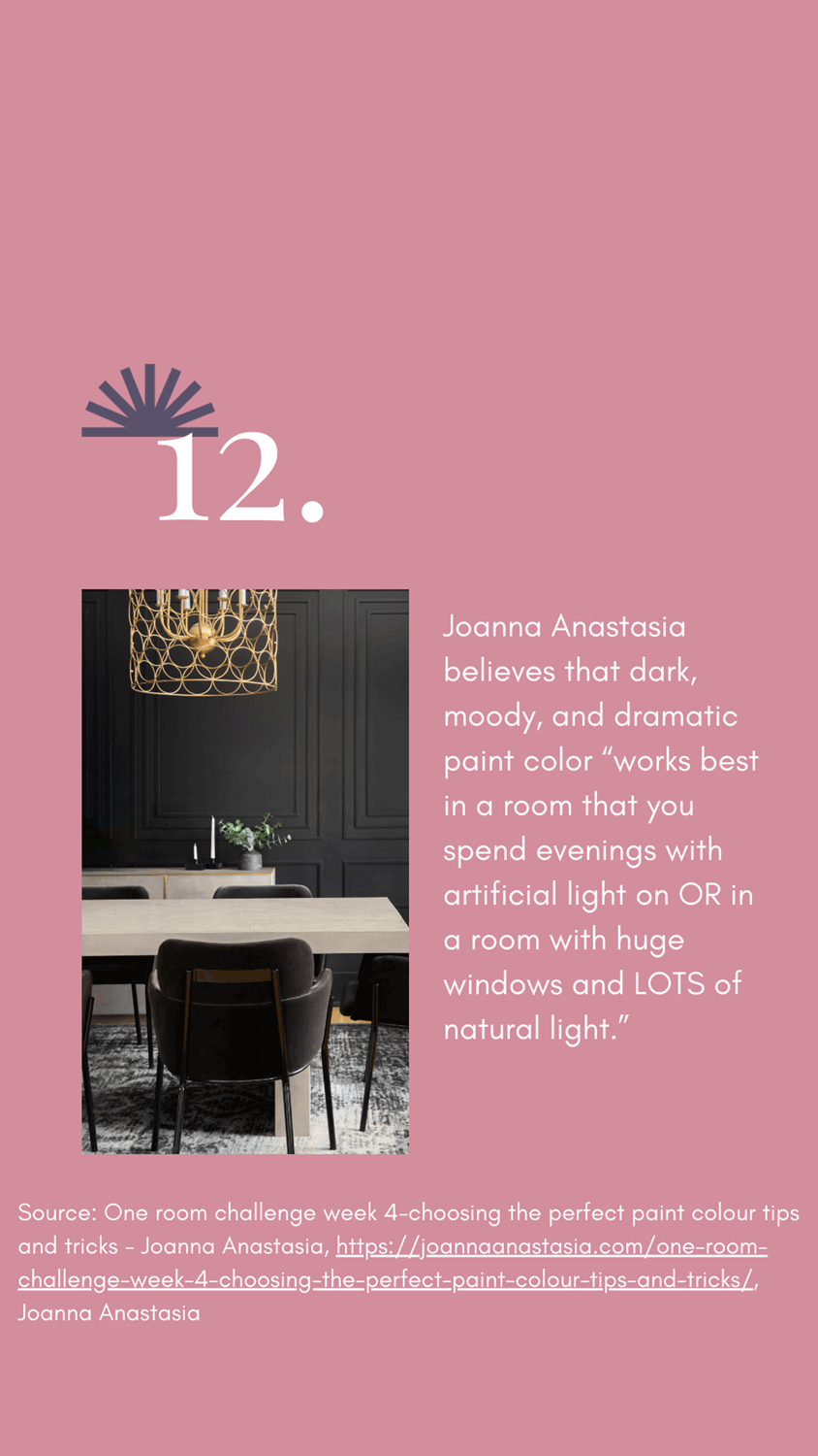
Joanna Anastasia believes that dark, moody, and dramatic paint color “works best in a room that you spend evenings with artificial light on OR in a room with huge windows and LOTS of natural light.”
Source: One room challenge week 4-choosing the perfect paint colour tips and tricks - Joanna Anastasia, https://joannaanastasia.com/one-room-challenge-week-4-choosing-the-perfect-paint-colour-tips-and-tricks/, Joanna Anastasia

Thinking of using white paint? You might want to reconsider if you don’t have much natural light according to Toni. “White in an ultimate designer choice– it makes everything else pop and enlarges any space. But, and that’s something we don’t hear enough- it can also look gray, drab and sad in a space that doesn’t have enough natural light.
White walls would not look great in our bedroom because of the lack of natural light, the beige carpet, and the wood trim. But a moody, greenish/bluish dreamy accent wall looks incredible, and my husband and I love it. We love it because I thought about what would be best for our space and fit our personal style, and then that’s exactly what I did.
I didn’t think about whether or not it would photograph well (it doesn’t) or be the trendy thing on Instagram. I thought about what would reflect our style and fit like a puzzle piece in our home, and that’s something you just can’t achieve with a cheap imitation.”
Source: How to Paint a Room - One Room Challenge Week 2 - Girl, Just DIY!, https://www.girljustdiy.com/paint-a-room-one-room-challenge-week-2/, Toni, 2018-06-14

“Choose a wipeable sheen (for white walls in a kid’s bedroom.)
I’m usually a flat sheen girl - I love that flat paint hides imperfections on walls and leaves a “high end” looking finish, but I know what Aaron’s walls looked like before I re-painted them and I had a feeling white walls were going to be even more challenging to keep clean. I think using a more wipeable finish when using white paint will save you countless headaches down the line. I opted for eggshell, but I’d also recommend matte or satin. I never recommend semi-gloss or gloss for walls (only trim) because it always looks messy due to the sheen.” - Catie Zee
Source: One Room Challenge: Week 3 - Tips for Painting White Walls — CATIE ZEE HOME, https://www.catiezeehome.com/blog/paintingwhitewalls, Catie

How to select a finish if you need to patch in the future
“So when I need to patch the wall, I think blending the flat white paint will be easier. Sometimes, when you need to patch walls with paint with a sheen, flashing can occur. Flashing is when the small patches of fresh paint stand out from the existing finish.” - Felicia
Source: Priming and painting: One Room Challenge, Week 6 - Hello home, girl!, https://hellohomegirl.com/priming-and-painting-one-room-challenge-week-6/, Felicia | hellohomegirl

Is Farrow and Ball your go-to paint? Tips for selecting finishes from Jeweled Interiors:
“I have a personal favorite plan for rooms that don’t get heavy use (think bedroom, living room, office). I like the 20% Sheen (Estate Eggshell) on the doors because it is washable and wipeable. I also opt to paint my base boards, casings, bookshelves, and architraves in the same smooth, velvety finish. Keep in mind that Farrow and Ball Eggshell is different than what Americans generally think of Eggshell. The Farrow and Ball version has more sheen.
Then for the walls I like the dead flat look of 2% Estate Emulsion. This is the Farrow and Ball signature paint, and I love their inexplicable chalky finish that has so much depth and character. It immediately transports me back to our time touring British mansions and manor houses. It feels so stately and gorgeous.”
Source: 5 Farrow and Ball Paint Tips ⋆ Jeweled Interiors, https://jeweledinteriors.com/2020/04/5-farrow-and-ball-paint-tips/, jeweledinteriors
CREATE A PLAN FOR HOW TO PAINT

“I always have a kneeling pad, a sturdy step ladder, two drop cloths (one for sliding around as I move throughout the room and one for keeping all of the supplies), an interchangeable screwdriver for removing hardware, clean paintbrushes for dusting, a can of LaCroix, stir sticks, and most importantly, a device for playing podcasts and tunes.”
Source: One Room Challenge Week 2 - Preparing for a Bold Wall Mural — The Gold Hive, https://www.thegoldhive.com/blog/2017/10/11/one-room-challenge-week-2-preparing-for-a-bold-wall-mural

“My tip for caulking is to use a small container with water and a few paper towels for cleaning up messy fingers, and for dipping into for a smooth swipe along the bead of caulking.” — Ashley
Source: One Room Challenge Week 2 - Preparing for a Bold Wall Mural — The Gold Hive, https://www.thegoldhive.com/blog/2017/10/11/one-room-challenge-week-2-preparing-for-a-bold-wall-mural, Ashley

Maximizing Tiny has a great solution for creating a high-end crown molding look on a budget.
“Now we’re working with whirlpool as the base color and raging sea as the secondary color. That color will be used on the crown moulding to create an illusion of a more built up crown and draw the eye upwards to help maximize the space visually.
We’ll be painting the base trim the same color as the wall , as opposed to keeping it white, lengthen the wall and add texture. This is one of the tricks I recommend when working within a color palette. The more of one color you see in a space, the more your brain registers it as ‘same’. In this case, by not breaking up the room with white trim or even adding contrasting trim at or below eye level, we’re forcing your eye upwards.”
Source: One Room Challenge - Week Four | A Little More Action — Maximizing Tiny, https://maximizingtiny.com/one-room-challenge/weekfour

“I prefer rolling walls but the sprayer works wonders on shelving, cabinetry and the fireplace with all it’s nooks and crannies.” - Jennifer J. Sullins
Source: ONE ROOM CHALLENGE LOUNGE | Week 2 – The Power of Paint -, https://jenniferjsullins.com/2020/10/15/one-room-challenge-lounge-week-2-the-power-of-paint/

“Tape around the entire room.
This method works better than every method I’ve tried. And having longer continuous tape to pull after you’re done painting goes much faster.
Here’s my best Tip for applying painter’s tape to baseboards and trim.
Pull out 6″ or so of tape from the roll.
Lay the tape roll on the baseboard and pressed it against the wall.
Line up the end of the tape against the wall to top of the baseboard only. Make sure it doesn’t stick up onto the wall.
Press down the tape area between the end and the tape roll.
Hold the tape in place while you pull out another 6″-8″ and repeat the process.
Make straight cuts at corners by placing your putty knife into the corner over the tape and pulling to tear the tape.” - Toni
Source: How to Paint a Room - One Room Challenge Week 2 - Girl, Just DIY!, https://www.girljustdiy.com/paint-a-room-one-room-challenge-week-2/, Toni

“It’s worth repositioning the tape however many times as you need so you have the tape right up against the edge. Shorter segments of tape also help you edge in the tape.” - Racheal
Source: One Room Challenge: Week 7 - Supernova Girl - Banyan Bridges, https://banyanbridges.com/one-room-challenge-week-7-supernova-girl/, racheal, 2021-06-16

This Dear Casa offers tips for painting in small spaces, “Try a painting hack for clean lines.
My husband shared this tip with me. It’s definitely a technique you can use in larger spaces too.
After taping off the area, paint along the edge of the tape using the color that is under the tape. This seals down the tape and instead of the new wall color potentially leaking under the tape, the existing color goes through. Sounds sort of odd, but look at the result below!
It might seem a bit tedious, but worth a try. Especially in a small space, you can devote some time to try it out.”
Source: 5 Painting Tips For A Small Space | ORC | Week 3 - This Dear Casa, https://thisdearcasa.com/5-painting-tips-for-a-small-space-orc-week-3/, this dear casa, 2021-10-14

“Even though I had primed the walls months ago when we finished the drywall, it is important to prime shortly before painting, so I needed to do at least one more coat of primer over everything.” - Rebecca
Source: One Room Challenge Week 2: Painting Tips | R&R at home, https://www.randrathome.com/2019/04/one-room-challenge-week-2-painting-tips.html

Devon offers advice for the correct order of painting a room:
“1.Ceilings
If you decided that you will be repainting the ceiling in the room, this is the place to start.
Make sure you have cleared out the room and laid down a layer of plastic or a drop cloth. You don’t want to drip paint onto the floor.
If you have a fireplace in the room, make sure it is draped with plastic or a drop cloth as well.
2. Walls
Now it is time to get the new color on the walls.
Make sure to tape of anything you do not want to paint, like windows and woodwork.
Be careful around the edges. You do not get paint where you don’t want it.
Paint rollers are great for any room. If you have a paint sprayer, these are perfect for larger rooms.
3. Woodwork
If you’re going to paint the trim around the floor and the windows, carefully paint these areas. This part of painting is the tedious part of the job.
4. Floors
If your room remodel involves painting the floor, this should be the last thing you do. Make sure you start in a corner away from the exit. Move across the floor in a back and forth pattern making your way to the door.
Now you know where to start. Enjoy your painting!”
Source: The Best Order For Painting A Room, https://midwesternmoms.com/order-for-painting-a-room/, Devon

“Technique + drying time
Generally, you should start at the edges with a brush (also called cutting in), and then switch to your roller to cover the larger areas.
Gloss and semi-gloss paints require more careful technique than flat, matte, and eggshell finishes. Gloss and semi-gloss paints are prone to drying with visible overlapping strokes and roller streaks if they aren’t rolled on correctly.
You can avoid this by maintaining a wet edge. To do this, work in small sections, and always paint from wet areas into dry ones, blending the edges as you go. Avoid letting painted sections dry completely before moving on.
You should always err on the side of caution with drying time and check the manufacturer’s instructions for drying time. Also, be aware that humidity and temperature can affect drying time, and if it’s too rainy or too cold it could prevent the paint from drying properly.
Lastly, don’t leave the painters tape on too long—you should peel it away about an hour after you’ve finished your last coat of paint. If you leave it on too long, flakes of dry paint are likely to come with it.” - Virginia Beshers
Source: How to Make Your DIY Paint Job Look Professional — ONE ROOM CHALLENGE®, https://www.oneroomchallenge.com/editorial/how-to-make-your-diy-paint-job-look-professional, Virginia Beshers

“Apply two coats of paint with a roller making sure to back-roll.
…Basically, after getting the paint on the wall, go back and roll all the way down in one motion and then overlap that line by about half a roller and repeat. It will give a more uniform finish.
Another way to ensure good, even coverage, is to not paint in a “W” pattern that you see in all the paint commercials. Start a new line of paint about a half roller distance away from where you just were. Spread that out while trying to roll the whole length of the wall (or ceiling). My painting professional friend taught me that and I really think it makes a difference in the outcome of my painting projects.” - Annie
Source: One Room Challenge Week 6: Paint – Life in a Fixer, https://lifeinafixer.com/2020/11/19/one-room-challenge-week-6-painting-tips/, Annie, 2020-11-19

“When you’re done with the last coat of paint follow my final tip and pull your tape, at a sharp angle off the trim immediately. Don’t wait and let the paint dry all the way or pulling the tape when the paint is dry could pull paint from the wall too. If you’re doing two coats it’s best to paint them both the same day, for the same reason.” - Toni, Girl, Just DYI!
Source: How to Paint a Room - One Room Challenge Week 2 - Girl, Just DIY!, https://www.girljustdiy.com/paint-a-room-one-room-challenge-week-2/, Toni, 2018-06-14


Week 3 Feature #1: Accent Lighting with Govee Glide Y Lights
One of my favorite features for this room design is the inclusion of Govee Glide Y lights, seen on HGTV and inspired me to use them. I purchased these lights with my own money, I am not affiliated with Govee in any way.
Govee Glide Y lights, which can interact with music and be controlled via an iPhone, offer several potential benefits for creating a sensory-friendly environment for a teenager with sensory processing sensitivity (SPS).
Videos About Govee Glide Y Lights
Benefits of Using Govee Y Lights in a Sensory-Friendly Teen Bedroom
1. Control and Customization
The ability to control and customize lighting via an iPhone means that my nephew can adjust the lighting based on their sensory needs at any moment. This level of control is crucial for those with SPS, as they can minimize sensory discomfort by modifying light intensity, colors, and patterns.
2. Sensory Regulation
The interactive feature that allows the lights to respond to music can be both a therapeutic tool and a way to enhance sensory integration. This can be especially beneficial during moments of high stress or anxiety, providing a distraction and a method to regulate sensory input.
3. Mood Enhancement
Lighting colors and dynamics can significantly affect mood. Colors like blues and purples, which we’re using for the room's color scheme, can be set on the Govee lights to enhance the calming effect of the room's overall aesthetic.
4. Visual Interest Without Overstimulation
The Glide Y series offers smooth transitions and soft color blends, which can add visual interest without the harshness or overstimulation that comes with more intense lighting systems. This is ideal for someone with SPS who might find abrupt changes or bright lights unsettling.
5. Routine and Atmosphere
Setting routines using the app—for instance, calming colors at bedtime or energizing colors when waking up—can help in establishing a comforting routine, which can be reassuring and stabilizing for someone with SPS.
In conclusion, the Govee Glide Y lights can be a valuable addition to a bedroom designed for a teen with sensory processing sensitivity, provided that their features are used thoughtfully to align with the individual’s specific sensory preferences and needs.
Sensory Integration Therapy & Govee Glide Y Lights:
Sensory integration therapy focuses on helping individuals better process and react to the sensory stimuli in their environment. Applying these principles to create a supportive environment for a teen with SPS involves several key strategies:
1. Controlled Sensory Input
It's crucial to create an environment where sensory input can be controlled and adjusted. This means using elements like the Govee Glide Y lights to allow for adjustments in lighting intensity and color, providing the teen with the ability to alter their environment based on their sensory needs at any given time.
2. Predictability and Routine
Sensory integration therapy emphasizes the importance of predictability and routine, which can help reduce anxiety and sensory overload. Using smart devices that can be programmed to change settings at certain times of the day can help in establishing a routine that the teen can rely on.
3. Minimized Overstimulation
Avoiding overstimulation is key. In the context of interior design and lighting, this means choosing colors and lighting transitions that are soothing rather than stimulating. The bedroom design should incorporate elements that are unlikely to trigger a sensory overload, such as soft fabrics, minimal clutter, and soothing sounds.
4. Therapeutic Elements
Incorporating therapeutic elements like weighted blankets or objects that the teen can manipulate can also be beneficial. These can provide comfort and grounding when sensory overload occurs.
5. Personal Space Design
Designing a personal space that the teen feels is their sanctuary is vital. This could involve areas where they can retreat to when feeling overwhelmed, such as a cozy corner with dimmable lights and soft seating.
6. Engagement and Activity
Finally, areas of the room designed for specific activities such as reading, studying, or relaxing can help the teen transition between different types of sensory input throughout the day. Each area can be tailored to support different sensory needs, such as brighter lights for studying and softer lights for relaxation.
Different Viewpoints Regarding SPS and Govee Glide Y Lights
💡 Lighting Design:
From a lighting perspective, I advocate for the use of Govee Glide Y lights due to their customizable settings and ability to adapt to an individual's sensory needs.
However, I do emphasize the importance of using such features judiciously to avoid sensory overload, particularly in dynamic modes that react to music.
Static, softer hues can often be more beneficial than constantly changing colors. To create a supportive environment using smart lighting, tailor the light settings to mimic natural light patterns, aligning with the teen's daily activities and circadian rhythms.
Use warm tones to wake up, bright white light during active hours for focus, and gradually transition to dim, warm tones to signal bedtime. Ensure these settings are easily adjustable to adapt to the teen’s sensory needs at any moment.
🎨 Interior Design:
While I appreciate the benefits of dynamic lighting in creating a stimulating environment, I would caution against excessive use of vivid or rapidly changing lights, especially in a bedroom intended for relaxation.
Integrate soft textures and minimize clutter to reduce sensory overload. Allow for personalization in the room’s decor to help the teen feel more in control of their environment.
My suggestion would focus on ensuring that any dynamic lighting complements the calm and serene atmosphere created by the navy and purple color scheme, perhaps by setting these lights to display predominantly blue and purple hues, which can reinforce the room's calming effect.
🔬 Color Psychology:
From a psychological standpoint, color and lighting can profoundly impact a person's mood and sensory experience. Dynamic lighting that interacts with music could stimulate creativity and positivity when used appropriately.
However, it's crucial to tailor this to the individual's sensory thresholds. Too much variability in light and color can be counterproductive, potentially leading to sensory overwhelm rather than sensory support.
Use colors and lighting that promote calmness, concentration, and relaxation appropriately throughout the day.
Consider the emotional and sensory responses to each color and light setting, adapting them to the needs of the teen with SPS.
Incorporate elements that can be manipulated or controlled by the teen to provide sensory feedback and grounding when needed, such as weighted blankets or tactile objects. Designate different areas of the room for specific activities to help manage sensory input effectively and create predictable and soothing spaces.
Q: What might be the opposing viewpoints or concerns regarding the use of smart lighting and vibrant color schemes in the room of a teenager with sensory processing sensitivity (SPS)?
A: While smart lighting and specific color schemes are generally seen as beneficial for creating a supportive environment for teens with sensory processing sensitivity, there are several concerns and alternative viewpoints that should be considered:
1. Over-Reliance on Technology
Concern: There's a risk of becoming overly reliant on technology, which can fail or malfunction, leaving the individual without their needed accommodations unexpectedly.
Alternative: Encourage natural solutions like maximizing natural light and using simpler, manual lighting solutions that are less likely to fail.
2. Potential for Overstimulation
Concern: Even with the ability to adjust settings, the interactive and dynamic nature of smart lights like Govee Glide Y might still pose a risk of overstimulation, especially if used improperly.
Alternative: Opt for more static lighting setups, such as the planned flush-mount ceiling light and the floor lamp, that provide consistent light without the variations that could lead to sensory overload.
3. Cost and Accessibility
Concern: Smart lighting systems can be expensive and not accessible to all families, potentially creating disparities in who can afford these sensory-friendly environments.
Alternative: Focus on more affordable and universally accessible design choices that don’t rely heavily on technology.
4. Long-Term Dependence
Concern: There's a possibility that using highly controlled environments might limit the teen's ability to cope with less predictable environments outside the home.
Alternative: Gradually expose Logan to a variety of environments to build resilience and coping mechanisms for different sensory inputs.
5. Vibrant Colors’ Impact
Concern: While colors like blues and purples are generally calming, individual responses to color can vary significantly. Overuse of any color, regardless of its general perception, can have unintended effects.
Alternative: Use neutral tones and introduce color through easily changeable decor elements like pillows or curtains rather than permanent features like wall paint.
In conclusion, while there are clear benefits to using smart lighting and specific color schemes for individuals with SPS, it is crucial to balance these with considerations of over-reliance, cost, long-term dependence, and individual variability in responses to sensory environments.
Lighting Settings for Govee Y Lights and Sensory Processing Sensitivity
Managing the light settings in a way that supports both physiological needs and personal preferences is crucial, especially for someone with sensory processing sensitivity.
Here's a breakdown of how to use the Govee Glide Y lights effectively throughout the day:
MORNING (Wake-up)
Light Setting: Use a soft, warm light to mimic sunrise, gradually increasing in brightness to gently wake the teen without causing sensory shock.
Color: Warm tones like soft orange or gentle yellow can energize and help in transitioning from sleep to wakefulness in a soothing manner.
MIDDAY (Active Hours)
Light Setting: Brighter, more natural white light to enhance focus and alertness during study or activity periods. This helps maintain concentration and can reduce the strain on eyes.
Color: Neutral to cool tones, which are known to support cognitive function and concentration.
EVENING (Wind Down)
Light Setting: Gradually dimming lights as evening progresses to prepare for sleep, mimicking the natural setting of the sun.
Color: Transition to warmer tones like soft reds or deep oranges, which can help signal to the body that it’s time to start preparing for sleep.
NIGHT (Sleep)
Light Setting: Minimal to no light, or use very dim, non-invasive lights if necessary (for those who may need a night light).
Color: Soft reds or none at all, as red light has the least potential to shift circadian rhythm and disturb sleep patterns.
SPECIAL FEATURES
Music Interaction: Use this feature sparingly, possibly during relaxation or gentle activity times, to create an engaging but not overwhelming sensory experience. The lights can react softly to calming music, providing sensory input that can be soothing and engaging.
By customizing these settings, the Govee Glide Y lights can support a sensory-sensitive teen’s needs throughout the day, enhancing their comfort and ability to function in their personal space.
Week 3 Sponsor Highlight: Beddy’s

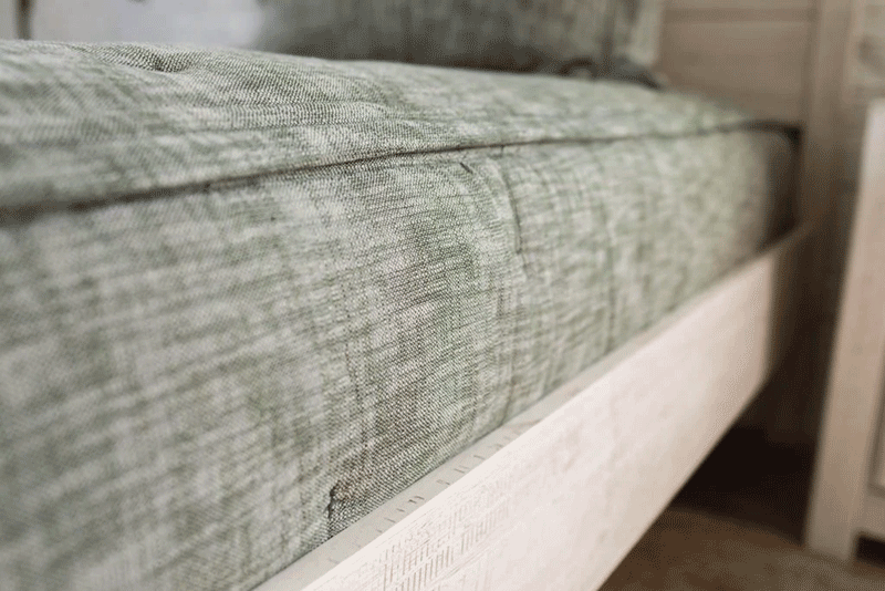
One of the first items selected for this bedroom makeover was a zippered bedding for the loft bed from Beddy’s, and I am honored that they agreed to be a sponsor.
As I mentioned earlier, my nephew Logan is sensory-processing sensitive (SPS). Big thanks to my sponsor Beddys.com for helping out!
I mentioned last week that I was considering painting the desk, drawers, and shelves that go under the loft bed. This week, I did a mock-up of what it would look like. My sister had mentioned that it might be too much for Logan, and once I inputted the bed with the different colors underneath, I immediately knew she was right, and that all white would look better.
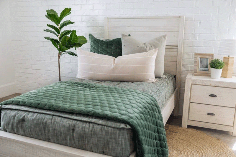
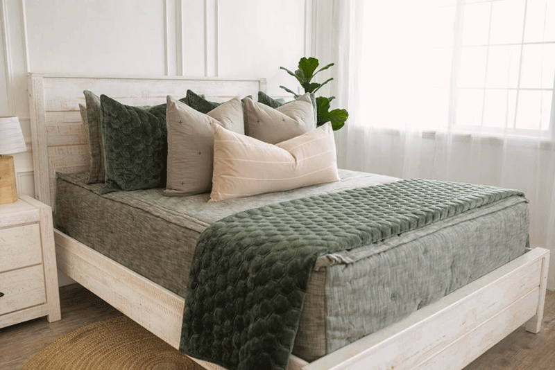
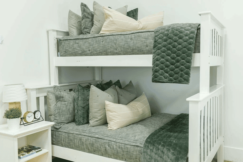
We selected the Remington Beddy to soften the colors in the room, and the custom galaxy fabric for the headboard ties the green in nicely.
I am ordering the Halston Luxe XL Euro pillow covers in blue, pairing them with the Remington Luxe Standard Shams, Remington Euro shams, and the Erin XL lumbar pillow in a gray leather to mix up textures.

Let's face it, finding bedding that keeps your SPS warrior snug and secure all night can feel like a challenge. Traditional sheets can be a tangled mess, and who needs that frustration at bedtime? Plus, if your child struggles with motor skills, wrestling with a loose sheet can lead to meltdowns in the middle of the night – no fun for anyone! It’s been good to receive feedback from my readers whose children have Beddy’s that they love them!
The good news: The right bedding and bed setup can make a world of difference. Here's why Beddy's is the perfect fit for my nephew's loft bed:

Zip it Up for Safety and Security
Traditional bed setups involve a fitted sheet, a top sheet, and a blanket – way too many pieces for some teens with SPS. These loose sheets can get twisted, bunch up, and be just plain annoying. (It even happens for me!)
Enter Beddy's! Their clever zipper design combines all those separate pieces into one big, comfy sleep sack. This creates a safe and enclosed sleep space that keeps your child cozy and prevents them from getting tangled in the sheets.
Think of it as a giant hug in bed form! Plus, Beddy's come in all different sizes, so you can find the perfect fit for your nephew's loft bed, bunk bed, or even a toddler bed.

Sensory Friendly Sleep Solutions
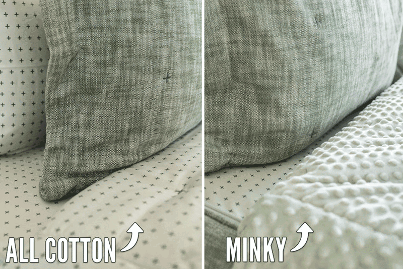
Let's talk about those delicate sensory needs. Many youngsters with SPS are super sensitive to touch. Beddy's are made with a super soft, cuddly fabric that feels amazing on the skin, and there is an option for a minky lining as shown below. They also have removable tags, so no scratchy surprises!

Easy to Make Means Easy for Everyone!
Making the bed can be a real struggle for those with motor skill challenges. With Beddy's, there's just one simple step – zip it up! This is a huge win for both your child's independence and your own sanity (no more wrestling with sheets in the morning!).

Beyond the Bedroom
Even if your child doesn't have SPS, Beddy's can be a great choice. They're perfect for hospital stays, sleepovers, or just creating a cozy reading nook. The easy-clean fabric makes them a lifesaver for busy parents too!
So, what are you waiting for? If you're looking for a safe, comfy, and sensory-friendly bedding solution for your child, Beddy's is definitely worth checking out. They come in a variety of colors and styles, so you can find one that matches your child's unique personality. And don’t forget the BOGO 50% off sale going on right now!!! Buy One, Get One 50% off site-wide. Whoa, now that's a great deal on Beddy's! Save up to 50% on Beddy's, the easiest bed to make, or on our new ZipBase Beddy's, which makes it even EASIER (especially on laundry day). Once you try zipper bedding, you'll want it for the entire house!”
Use code: 10BDAYBOGO


Head over to Beddy's website to learn more and find the perfect fit for your fam! Sweet dreams!
Final Thoughts
In conclusion, we’re almost halfway done in the One Room Challenge for Logan’s bedroom makeover! This week we focused on the painting progress and shared a wealth of tips from fellow One Room Challenge participants on how to achieve a professional-looking paint job.
We learned about selecting the right paint color, prepping the room, applying the paint, and even how to remove painter’s tape for clean lines.
Thanks to my sister, the walls are almost entirely painted, with just the doors left. The custom fabric for the headboards and new dresser knobs have also arrived, adding another layer of personalization to the space.
Next Week
You’ll get to see next week our progress putting the loft bed together which will be tackled this weekend, upholstering the headboards, and adding campaign hardware to the loft bed. Perhaps all of the painting will be completed too!
My question to you is what would you like to see me blog about for next week regarding this room makeover?
We’re excited to continue making progress on Logan’s room and can’t wait to reveal the more progress photos and updates! In the meantime, let us know in the comments what you think of the painting progress and the Govee Glide Y light feature!
We love connecting with you on social media! Whether you're leaving a comment below, sharing your thoughts on Instagram (@julie_ann_rachelle), or pinning your favorite design ideas on Pinterest, your interaction fuels our passion for creating beautiful and functional spaces.
See you next week for another exciting installment of Logan's futuristic sensory escape!
Stay up-to-date on Logan's room makeover by following my blog posts at the Blended Decor Blog by subscribing and follow social media updates on Instagram.
Week One: April 3 Introduction and Inspiration
Week Two: April 10 Design Concept
Week Three: April 17 Painting Tips
Week Four: April 24 DIY Headboard and Low Loft Build
Week Five: May 1 Unboxing, Lighting, ORC FAQs
Week Six: May 8 Must Have Tool for Interior Designers
Week Seven: May 15 Using Technology and Apps For the Win
Week Eight: May 22 The Big Reveal! Let’s party!!!
Join the conversation


Affiliate Disclosure
Copyright Act of 1976 Section 107 Fair Use Disclaimer
Related Posts